Birrabot
Birrabot
Birrabot
Birrabot
Birrabot
Birrabot
Birrabot
selling beer humanely with a robot
selling beer humanely with a robot
selling beer humanely with a robot
selling beer humanely with a robot
selling beer humanely with a robot
selling beer humanely with a robot
selling beer humanely with a robot


Overview
Overview
Overview
Overview
Overview
Overview
Overview
000
000
000
000
000
000
000
Type
Type
Academic.
Academic.
Type
Academic.
Type
Academic.
Type
Academic.
Type
Academic.
Type
Academic.
Time
Time
4 weeks.
4 weeks.
Time
4 weeks.
Time
4 weeks.
Time
4 weeks.
Time
4 weeks.
Time
4 weeks.
Team
Team
Groups of 4 students.
Groups of 4 students.
Team
Groups of 4 students.
Team
Groups of 4 students.
Team
Groups of 4 students.
Team
Groups of 4 students.
Team
Groups of 4 students.
Challenge
Challenge
Designing a self service kiosk/totem for a craft beer establishment, aiming to relieve staff during peak hours and cut customer wait time.
Designing a self service kiosk/totem for a craft beer establishment, aiming to relieve staff during peak hours and cut customer wait time.
Challenge
Designing a self service kiosk/totem for a craft beer establishment, aiming to relieve staff during peak hours and cut customer wait time.
Challenge
Designing a self service kiosk/totem for a craft beer establishment, aiming to relieve staff during peak hours and cut customer wait time.
Challenge
Designing a self service kiosk/totem for a craft beer establishment, aiming to relieve staff during peak hours and cut customer wait time.
Challenge
Designing a self service kiosk/totem for a craft beer establishment, aiming to relieve staff during peak hours and cut customer wait time.
Challenge
Designing a self service kiosk/totem for a craft beer establishment, aiming to relieve staff during peak hours and cut customer wait time.
Requirements
Requirements
1.
1.
Designing an interactive Hi-fi prototype of the product.
Designing an interactive Hi-fi prototype of the product.
2.
2.
Allowing the user to customize different aspects of their order (like choosing between a full or half pint)
Allowing the user to customize different aspects of their order (like choosing between a full or half pint)
3.
3.
Thinking of a ‘’realistic’’ implementation of the physical product.
Thinking of a ‘’realistic’’ implementation of the physical product.
Requirements
1.
Designing an interactive Hi-fi prototype of the product.
2.
Allowing the user to customize different aspects of their order (like choosing between a full or half pint)
3.
Thinking of a ‘’realistic’’ implementation of the physical product.
Requirements
1.
Designing an interactive Hi-fi prototype of the product.
2.
Allowing the user to customize different aspects of their order (like choosing between a full or half pint)
3.
Thinking of a ‘’realistic’’ implementation of the physical product.
Requirements
1.
Designing an interactive Hi-fi prototype of the product.
2.
Allowing the user to customize different aspects of their order (like choosing between a full or half pint)
3.
Thinking of a ‘’realistic’’ implementation of the physical product.
Requirements
1.
Designing an interactive Hi-fi prototype of the product.
2.
Allowing the user to customize different aspects of their order (like choosing between a full or half pint)
3.
Thinking of a ‘’realistic’’ implementation of the physical product.
Requirements
1.
Designing an interactive Hi-fi prototype of the product.
2.
Allowing the user to customize different aspects of their order (like choosing between a full or half pint)
3.
Thinking of a ‘’realistic’’ implementation of the physical product.
Context
Context
Birrabot was my first UX centric project at college. Thanks to a good proffessor, it birthed my passion for the discipline.
Birrabot was my first UX centric project at college. Thanks to a good proffessor, it birthed my passion for the discipline.
Context
Birrabot was my first UX centric project at college. Thanks to a good proffessor, it birthed my passion for the discipline.
Context
Birrabot was my first UX centric project at college. Thanks to a good proffessor, it birthed my passion for the discipline.
Context
Birrabot was my first UX centric project at college. Thanks to a good proffessor, it birthed my passion for the discipline.
Context
Birrabot was my first UX centric project at college. Thanks to a good proffessor, it birthed my passion for the discipline.
Context
Birrabot was my first UX centric project at college. Thanks to a good proffessor, it birthed my passion for the discipline.
My Involvment
My Involvment
Collaborated with the team during the initial understanding of the problem and its users, defining the potential implementation of the totem and designing the information architecture. Full ownership of final UI and prototype design.
Collaborated with the team during the initial understanding of the problem and its users, defining the potential implementation of the totem and designing the information architecture. Full ownership of final UI and prototype design.
My Involvment
Collaborated with the team during the initial understanding of the problem and its users, defining the potential implementation of the totem and designing the information architecture. Full ownership of final UI and prototype design.
My Involvment
Collaborated with the team during the initial understanding of the problem and its users, defining the potential implementation of the totem and designing the information architecture. Full ownership of final UI and prototype design.
My Involvment
Collaborated with the team during the initial understanding of the problem and its users, defining the potential implementation of the totem and designing the information architecture. Full ownership of final UI and prototype design.
My Involvment
Collaborated with the team during the initial understanding of the problem and its users, defining the potential implementation of the totem and designing the information architecture. Full ownership of final UI and prototype design.
My Involvment
Collaborated with the team during the initial understanding of the problem and its users, defining the potential implementation of the totem and designing the information architecture. Full ownership of final UI and prototype design.
Discovery
Discovery
Discovery
Discovery
Discovery
Discovery
Discovery
001
001
001
001
001
001
001
The primary focus of the assignment was to exercise empathy and common sense. We were baing evaluated by our ability to hypothesize pain points and effectively design to address them.
The primary focus of the assignment was to exercise empathy and common sense. We were baing evaluated by our ability to hypothesize pain points and effectively design to address them.
The primary focus of the assignment was to exercise empathy and common sense. We were baing evaluated by our ability to hypothesize pain points and effectively design to address them.
The primary focus of the assignment was to exercise empathy and common sense. We were baing evaluated by our ability to hypothesize pain points and effectively design to address them.
The primary focus of the assignment was to exercise empathy and common sense. We were baing evaluated by our ability to hypothesize pain points and effectively design to address them.
The primary focus of the assignment was to exercise empathy and common sense. We were baing evaluated by our ability to hypothesize pain points and effectively design to address them.
The primary focus of the assignment was to exercise empathy and common sense. We were baing evaluated by our ability to hypothesize pain points and effectively design to address them.
Who do we design for?
Who do we design for?
3 main archetypes were defined.
3 main archetypes were defined.
(Average age between 22 to 34)
(Average age between 22 to 34)
Who do we design for?
3 main archetypes were defined.
(Average age between 22 to 34)
Who do we design for?
3 main archetypes were defined.
(Average age between 22 to 34)
Who do we design for?
3 main archetypes were defined.
(Average age between 22 to 34)
Who do we design for?
3 main archetypes were defined.
(Average age between 22 to 34)
Who do we design for?
3 main archetypes were defined.
(Average age between 22 to 34)
Local
●
Loyal customer.
●
Friends with staff and other locals.
●
Usually a student.
Needs
●
Having their loyalty rewarded.
When happy
●
Keeps their loyalty.
●
Invites friends.
Tourist
●
Limited use of the language.
●
Fleeting stay.
●
Interested in socializing.
Needs
●
Having a positive experience that adds value to their trip.
When happy
●
Leaves a good review online.
●
Recommends it.
One Nighter
●
Unloyal.
●
Usually dragged up by a local.
●
Unfamiliar with the place.
Needs
●
Feeling welcomed and accommodated.
When happy
●
Gains their loyalty.
Tourist
Tourist
Tourist
●
Limited use of the language.
Limited use of the language.
Limited use of the language.
●
Fleeting stay.
Fleeting stay.
Fleeting stay.
●
Interested in socializing.
Interested in socializing.
Interested in socializing.
Needs
●
Having a positive experience that adds value to their trip.
When happy
●
Leaves a good review online.
●
Recommends it.
Needs
●
Having a positive experience that adds value to their trip.
When happy
●
Leaves a good review online.
●
Recommends it.
Needs
●
Having a positive experience that adds value to their trip.
When happy
●
Leaves a good review online.
●
Recommends it.
Needs
●
Having a positive experience that adds value to their trip.
When happy
●
Leaves a good review online.
●
Recommends it.
One Nighter
One Nighter
One Nighter
●
Unloyal.
Unloyal.
Unloyal.
●
Usually dragged up by a local.
Usually dragged up by a local.
Usually dragged up by a local.
●
Unfamiliar with the place.
Unfamiliar with the place.
Unfamiliar with the place.
Needs
●
Feeling welcomed and accommodated.
When happy
●
Gains their loyalty.
Needs
●
Feeling welcomed and accommodated.
When happy
●
Gains their loyalty.
Needs
●
Feeling welcomed and accommodated.
When happy
●
Gains their loyalty.
Needs
●
Feeling welcomed and accommodated.
When happy
●
Gains their loyalty.
Local
Local
Local
●
Loyal customer.
Loyal customer.
Loyal customer.
●
Friends with staff and other locals.
Friends with staff and other locals.
Friends with staff and other locals.
●
Usually a student.
Usually a student.
Usually a student.
Needs
●
Having their loyalty rewarded.
When happy
●
Keeps their loyalty.
●
Invites friends.
Needs
●
Having their loyalty rewarded.
When happy
●
Keeps their loyalty.
●
Invites friends.
Needs
●
Having their loyalty rewarded.
When happy
●
Keeps their loyalty.
●
Invites friends.
Needs
●
Having their loyalty rewarded.
When happy
●
Keeps their loyalty.
●
Invites friends.
Local
Local
Local
●
Loyal customer.
Loyal customer.
Loyal customer.
●
Friends with staff and other locals.
Friends with staff and other locals.
Friends with staff and other locals.
●
Usually a student.
Usually a student.
Usually a student.
Tourist
Tourist
Tourist
●
Limited use of the language.
Limited use of the language.
Limited use of the language.
●
Fleeting stay.
Fleeting stay.
Fleeting stay.
●
Interested in socializing.
Interested in socializing.
Interested in socializing.
One Nighter
One Nighter
One Nighter
●
Unloyal.
Unloyal.
Unloyal.
●
Usually dragged up by a local.
Usually dragged up by a local.
Usually dragged up by a local.
●
Unfamiliar with the place.
Unfamiliar with the place.
Unfamiliar with the place.
Needs
Needs
Needs
●
Having their loyalty rewarded.
Having their loyalty rewarded.
Having their loyalty rewarded.
●
Having a positive experience that adds value to their trip.
Having a positive experience that adds value to their trip.
Having a positive experience that adds value to their trip.
●
Feeling welcomed and accommodated.
Feeling welcomed and accommodated.
Feeling welcomed and accommodated.
When happy
When happy
When happy
●
Keeps their loyalty.
Keeps their loyalty.
Keeps their loyalty.
●
Invites friends.
Invites friends.
Invites friends.
●
Leaves a good review online.
Leaves a good review online.
Leaves a good review online.
●
Recommends it.
Recommends it.
Recommends it.
●
Gains their loyalty.
Gains their loyalty.
Gains their loyalty.
What are the conditions of use?
What are the conditions of use?
Common stressors:
Common stressors:
(Peak hour occurs between 1:00-3:15 am.)
(Peak hour occurs between 1:00-3:15 am.)
What are the conditions of use?
Common stressors:
(Peak hour occurs between 1:00-3:15 am.)
What are the conditions of use?
Common stressors:
(Peak hour occurs between 1:00-3:15 am.)
What are the conditions of use?
Common stressors:
(Peak hour occurs between 1:00-3:15 am.)
What are the conditions of use?
Common stressors:
(Peak hour occurs between 1:00-3:15 am.)
What are the conditions of use?
Common stressors:
(Peak hour occurs between 1:00-3:15 am.)
Low Light
Low Light
Low Light
Wet Fingers
Wet Fingers
Wet Fingers
Drunk State
Drunk State
Drunk State
Loud Noise
Loud Noise
Loud Noise
Language Barrier
Language Barrier
Language Barrier
How can we address those pain points?
How can we address those pain points?
Stress relievers:
Stress relievers:
1.
1.
Streamlining user flows to only present one task at a time and reduce cognitive load.
Streamlining user flows to only present one task at a time and reduce cognitive load.
2.
2.
High contrast colors to improve vision accessibility in dim light conditions.
High contrast colors to improve vision accessibility in dim light conditions.
3.
3.
Constant feedback on the screens to reduce doubt while performing an action.
Constant feedback on the screens to reduce doubt while performing an action.
4.
4.
Big surface areas for interactive elements to minimize user input errors.
Big surface areas for interactive elements to minimize user input errors.
How can we address those pain points?
Stress relievers:
1.
Streamlining user flows to only present one task at a time and reduce cognitive load.
2.
High contrast colors to improve vision accessibility in dim light conditions.
3.
Constant feedback on the screens to reduce doubt while performing an action.
4.
Big surface areas for interactive elements to minimize user input errors.
Ideation
Ideation
Ideation
Ideation
Ideation
Ideation
Ideation
002
002
002
002
002
002
002
Implementation
Implementation
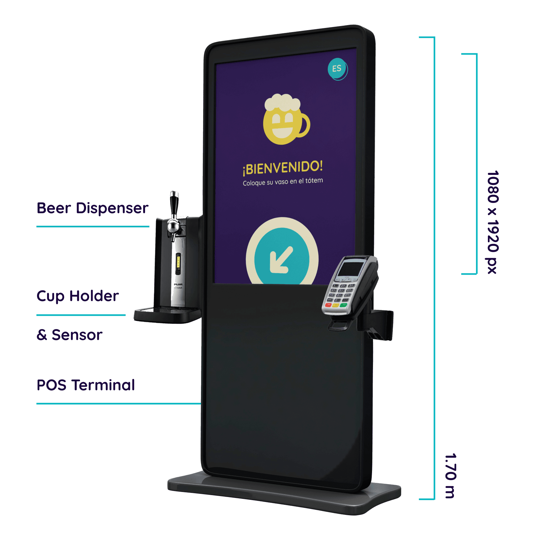
Our proposed solution involved NFC chips attached to the bottom of the cups and a sensor on the totem to identify said chips and ID each cup.
Our proposed solution involved NFC chips attached to the bottom of the cups and a sensor on the totem to identify said chips and ID each cup.
Implementation
Our proposed solution involved NFC chips attached to the bottom of the cups and a sensor on the totem to identify said chips and ID each cup.
Implementation
Our proposed solution involved NFC chips attached to the bottom of the cups and a sensor on the totem to identify said chips and ID each cup.
Implementation
Our proposed solution involved NFC chips attached to the bottom of the cups and a sensor on the totem to identify said chips and ID each cup.
Implementation
Our proposed solution involved NFC chips attached to the bottom of the cups and a sensor on the totem to identify said chips and ID each cup.
Implementation
Our proposed solution involved NFC chips attached to the bottom of the cups and a sensor on the totem to identify said chips and ID each cup.
ID’ing the cups would allow for a couple things:
ID’ing the cups would allow for a couple things:
●
●
Allowing for an ID registration system where logged in users would get a free beer every 5 orders, as an incentive for locals (one could also be a guest but wouldn’t get the benefit).
Allowing for an ID registration system where logged in users would get a free beer every 5 orders, as an incentive for locals (one could also be a guest but wouldn’t get the benefit).
●
●
Automatically discerning between a half pint and a full pint cup, thus cutting down one manual input from the user flows.
Automatically discerning between a half pint and a full pint cup, thus cutting down one manual input from the user flows.
●
●
Automatically discerning between a half pint and a full pint cup, thus cutting down one manual input from the user flows.
Automatically discerning between a half pint and a full pint cup, thus cutting down one manual input from the user flows.
ID’ing the cups would allow for a couple things:
●
Allowing for an ID registration system where logged in users would get a free beer every 5 orders, as an incentive for locals (one could also be a guest but wouldn’t get the benefit).
●
Automatically discerning between a half pint and a full pint cup, thus cutting down one manual input from the user flows.
●
Automatically discerning between a half pint and a full pint cup, thus cutting down one manual input from the user flows.


Information Architecture
Information Architecture
Our main goal during this stage was to reduce the amount of screens/steps needed for the user to complete their order. It was crucial to strike a balance between only presenting the user with one decision at a time and not dragging the user flows unnecessarily.
Our main goal during this stage was to reduce the amount of screens/steps needed for the user to complete their order. It was crucial to strike a balance between only presenting the user with one decision at a time and not dragging the user flows unnecessarily.
(Drag the image below to check out User Flows)
(Drag the image below to check out User Flows)
Information Architecture
Our main goal during this stage was to reduce the amount of screens/steps needed for the user to complete their order. It was crucial to strike a balance between only presenting the user with one decision at a time and not dragging the user flows unnecessarily.
(Drag the image below to check out User Flows)


Design
Design
Design
Design
Design
Design
Design
003
003
003
003
003
003
003
Wireframes & Low-fi prototype
Wireframes & Low-fi prototype
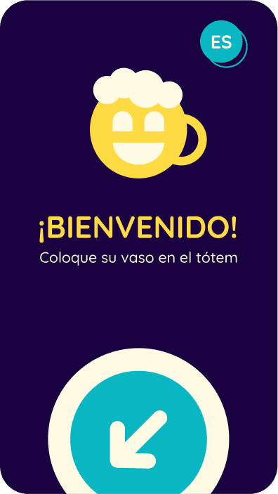
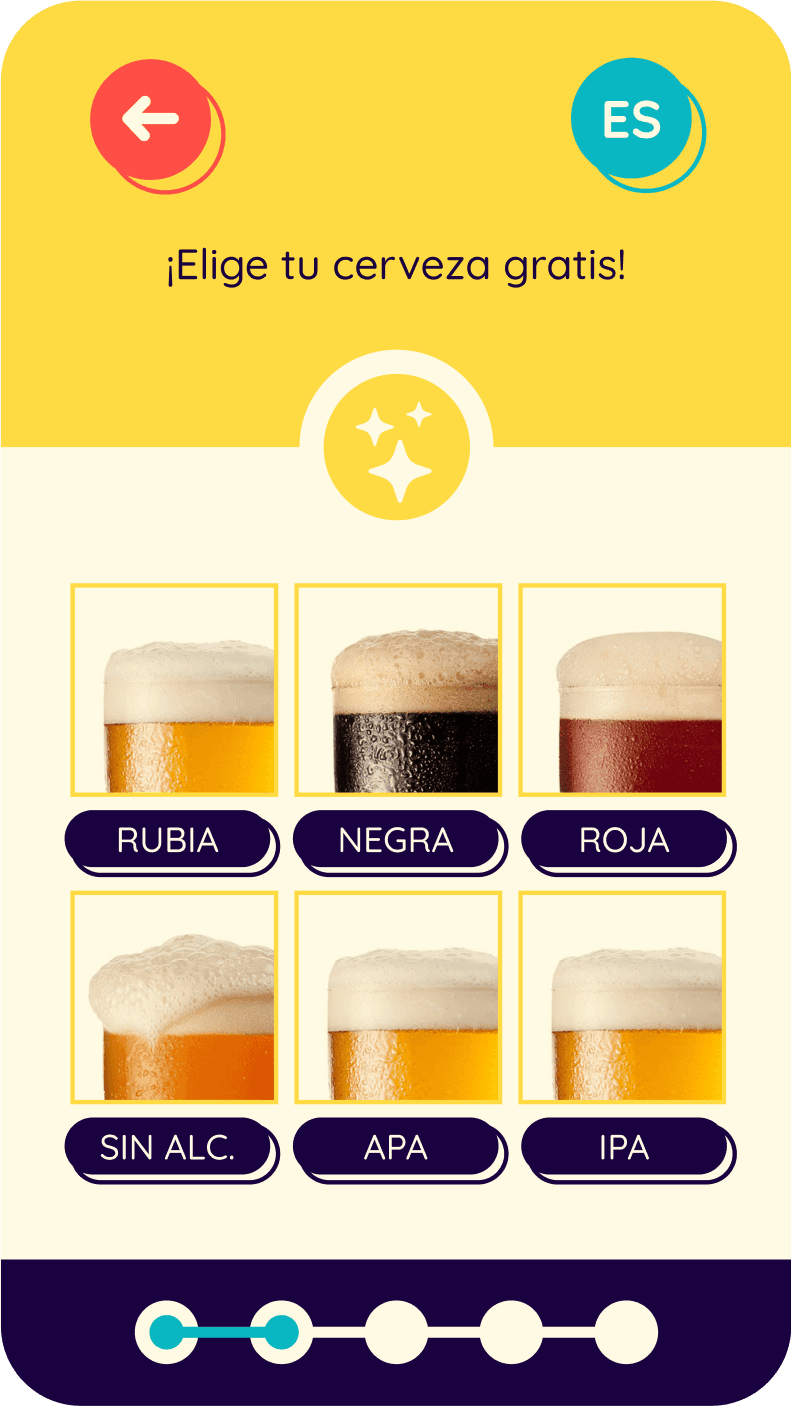
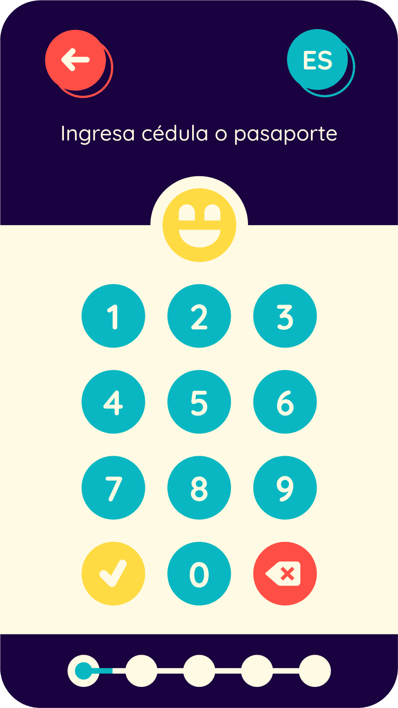
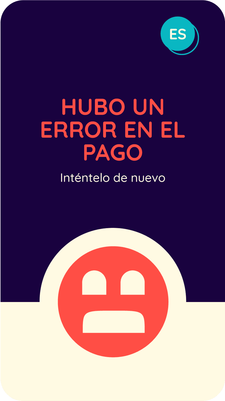
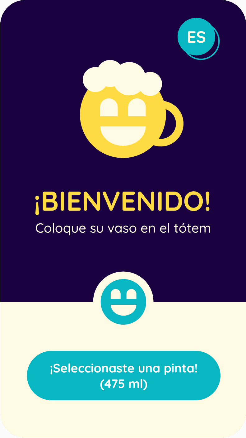
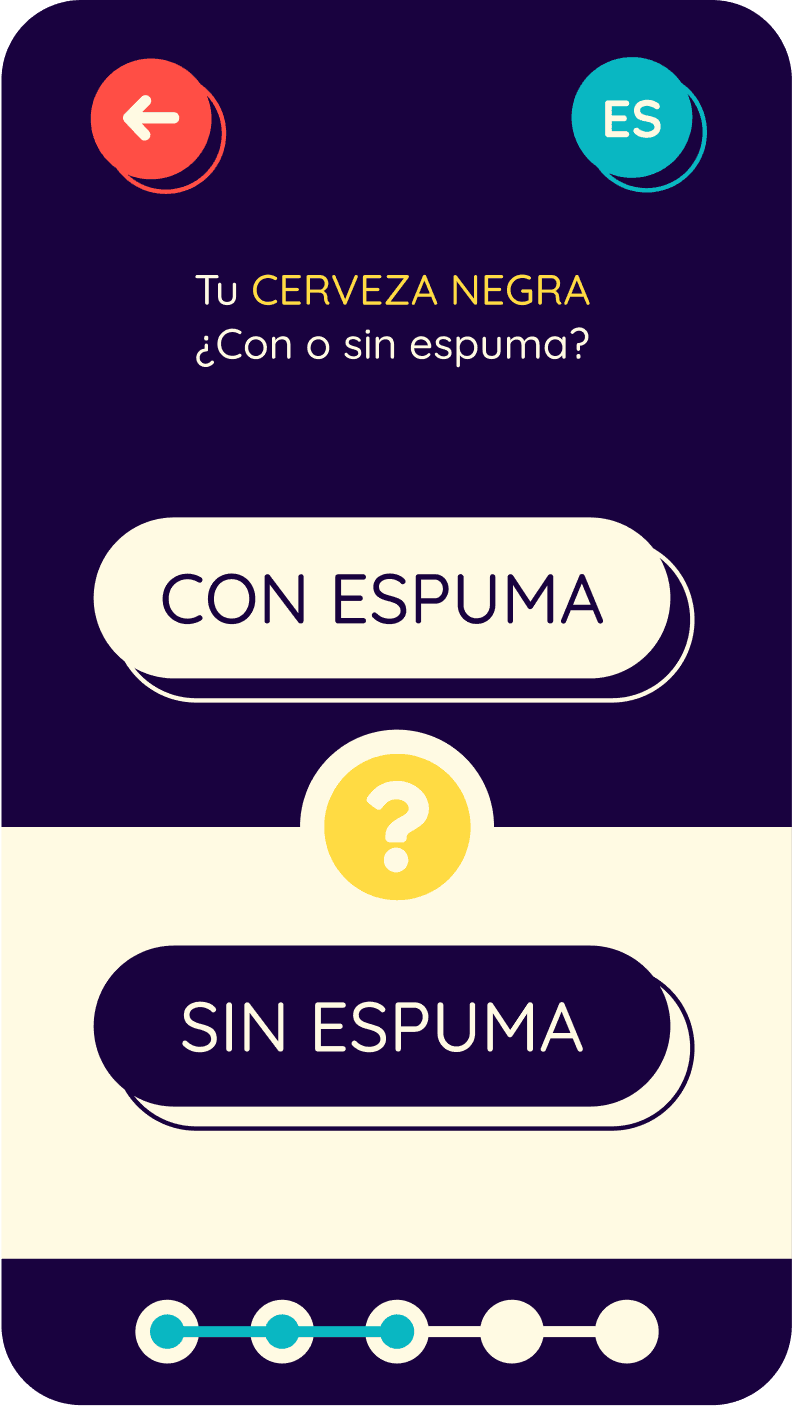
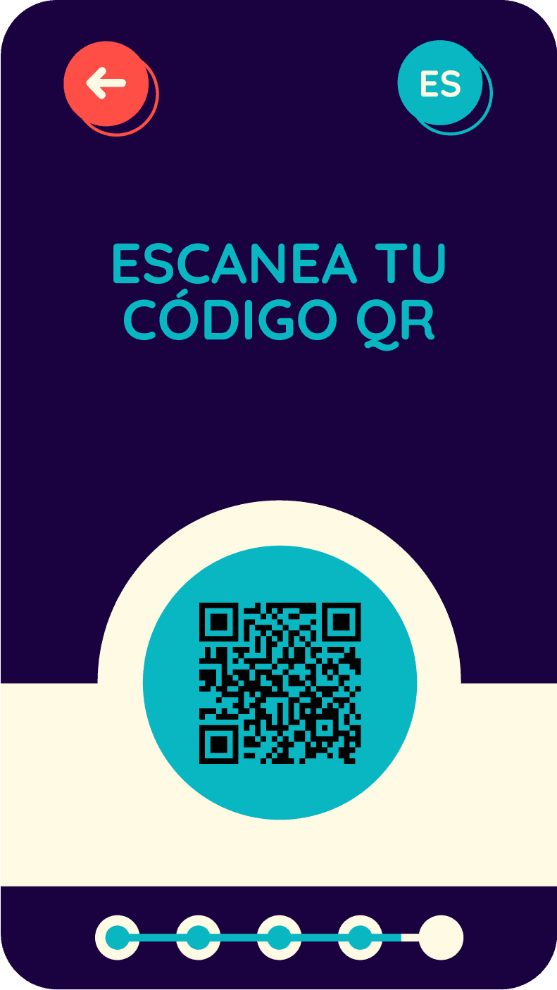
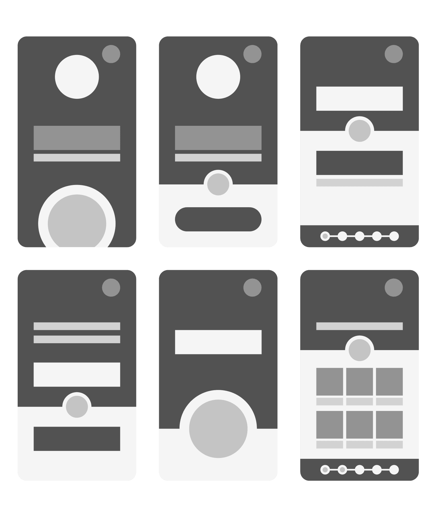
We enhanced the feeling of a fast paced and dynamic experience, expanding upon the idea of a ‘’single task’’ flow. In order to achieve that we used big simple shapes to highlight and contrast each presented option.
We enhanced the feeling of a fast paced and dynamic experience, expanding upon the idea of a ‘’single task’’ flow. In order to achieve that we used big simple shapes to highlight and contrast each presented option.
Wireframes & Low-fi prototype
We enhanced the feeling of a fast paced and dynamic experience, expanding upon the idea of a ‘’single task’’ flow. In order to achieve that we used big simple shapes to highlight and contrast each presented option.
Wireframes & Low-fi prototype
We enhanced the feeling of a fast paced and dynamic experience, expanding upon the idea of a ‘’single task’’ flow. In order to achieve that we used big simple shapes to highlight and contrast each presented option.
Wireframes & Low-fi prototype
We enhanced the feeling of a fast paced and dynamic experience, expanding upon the idea of a ‘’single task’’ flow. In order to achieve that we used big simple shapes to highlight and contrast each presented option.
Wireframes & Low-fi prototype
We enhanced the feeling of a fast paced and dynamic experience, expanding upon the idea of a ‘’single task’’ flow. In order to achieve that we used big simple shapes to highlight and contrast each presented option.
Wireframes & Low-fi prototype
We enhanced the feeling of a fast paced and dynamic experience, expanding upon the idea of a ‘’single task’’ flow. In order to achieve that we used big simple shapes to highlight and contrast each presented option.


Meet Tipsy!
Meet Tipsy!
The last thing we needed to address was to make the totem approachable and a fun experience for the tourists and the one-nighters.
The last thing we needed to address was to make the totem approachable and a fun experience for the tourists and the one-nighters.
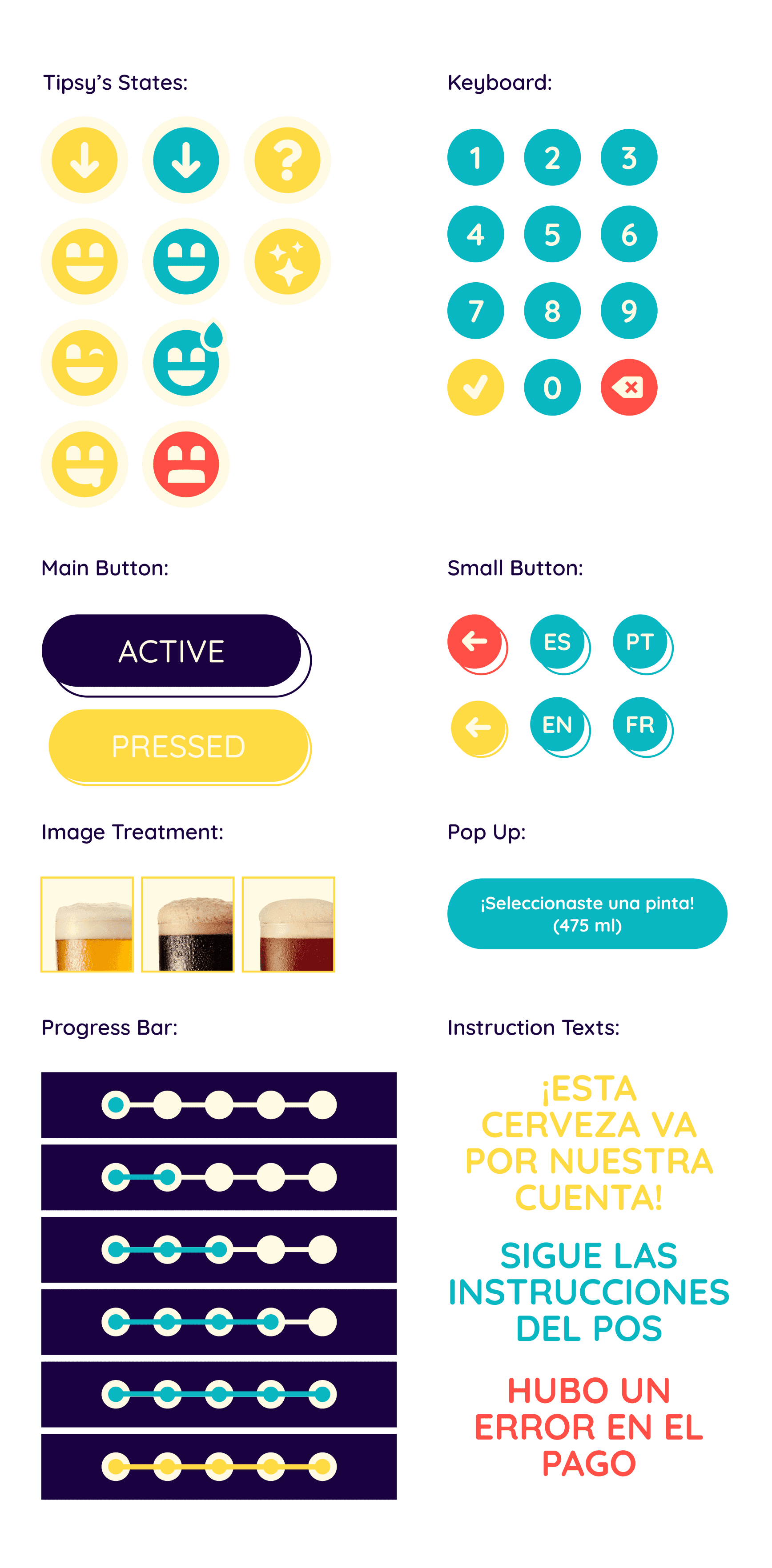
Tipsy is the bot in Birrabot, a mascot mitigating the lack of human interaction and providing constant system feedback to the user.
Tipsy is the bot in Birrabot, a mascot mitigating the lack of human interaction and providing constant system feedback to the user.
Meet Tipsy!
The last thing we needed to address was to make the totem approachable and a fun experience for the tourists and the one-nighters.
Tipsy is the bot in Birrabot, a mascot mitigating the lack of human interaction and providing constant system feedback to the user.
Meet Tipsy!
The last thing we needed to address was to make the totem approachable and a fun experience for the tourists and the one-nighters.
Tipsy is the bot in Birrabot, a mascot mitigating the lack of human interaction and providing constant system feedback to the user.
Meet Tipsy!
The last thing we needed to address was to make the totem approachable and a fun experience for the tourists and the one-nighters.
Tipsy is the bot in Birrabot, a mascot mitigating the lack of human interaction and providing constant system feedback to the user.
Meet Tipsy!
The last thing we needed to address was to make the totem approachable and a fun experience for the tourists and the one-nighters.
Tipsy is the bot in Birrabot, a mascot mitigating the lack of human interaction and providing constant system feedback to the user.
Meet Tipsy!
The last thing we needed to address was to make the totem approachable and a fun experience for the tourists and the one-nighters.
Tipsy is the bot in Birrabot, a mascot mitigating the lack of human interaction and providing constant system feedback to the user.
Friendly Shaped
Friendly Shaped
Friendly Shaped
+
+
+
Expressive
Expressive
Expressive
+
+
+
Simple Design
Simple Design
Simple Design
Typography & Colors
Typography & Colors
Typography & Colors
Typography & Colors
Typography & Colors
Typography & Colors
Typography & Colors


Components
Components
Components
Components
Components
Components
Components
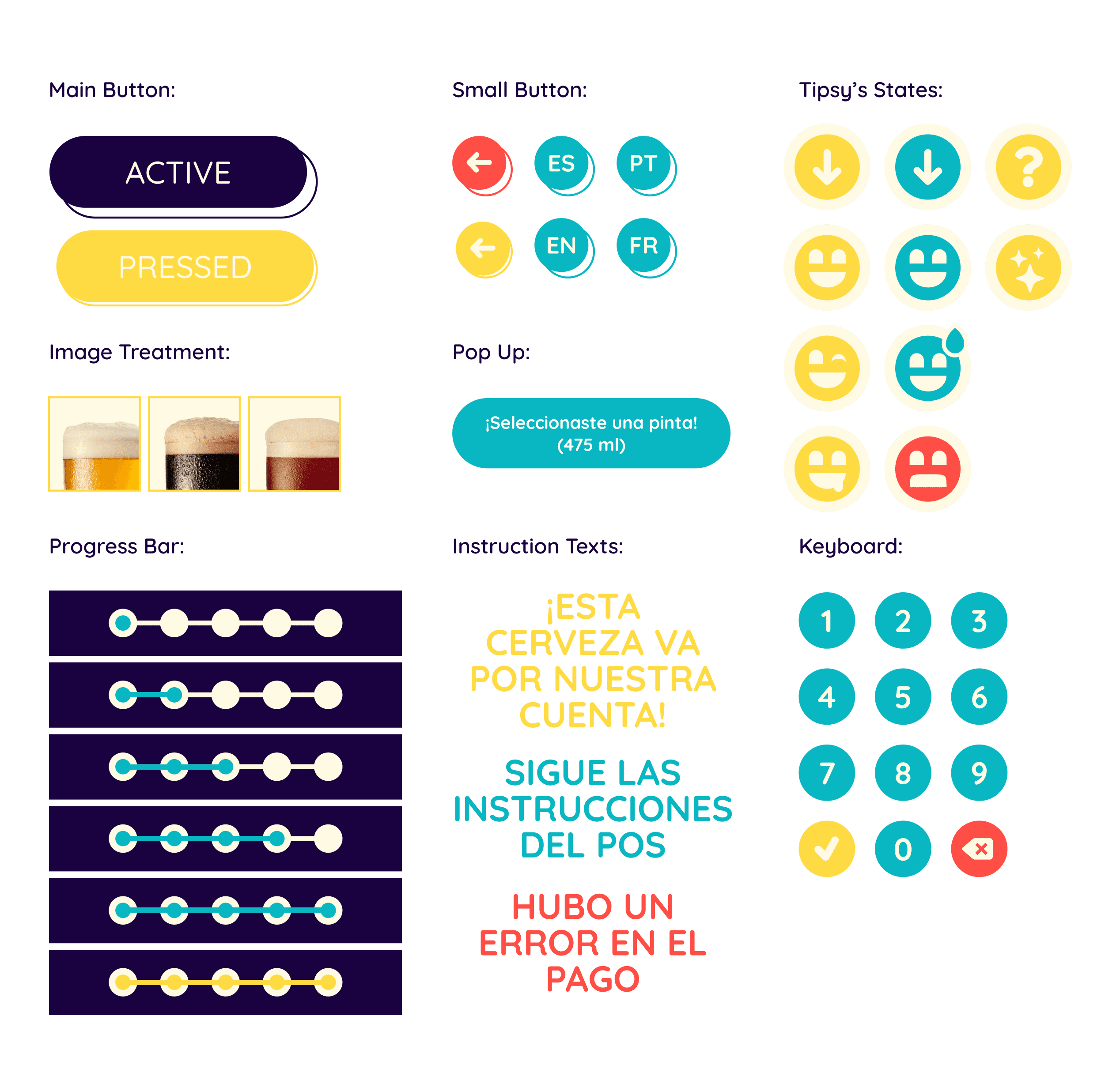


Final Prototype
Final Prototype
Final Prototype
Final Prototype
Final Prototype
Final Prototype
Final Prototype
Learnings
Learnings
Learnings
Learnings
Learnings
Learnings
Learnings
004
004
004
004
004
004
004
This project represents my humble beginnings into UX, and while there's clear room for improvement, I still stand by it (mostly). I'm particularly grateful for the opportunity to begin with an unconventional assignment such as a totem, since it opened my mind to the physical implications of digital products.
This project represents my humble beginnings into UX, and while there's clear room for improvement, I still stand by it (mostly). I'm particularly grateful for the opportunity to begin with an unconventional assignment such as a totem, since it opened my mind to the physical implications of digital products.
This project represents my humble beginnings into UX, and while there's clear room for improvement, I still stand by it (mostly). I'm particularly grateful for the opportunity to begin with an unconventional assignment such as a totem, since it opened my mind to the physical implications of digital products.
This project represents my humble beginnings into UX, and while there's clear room for improvement, I still stand by it (mostly). I'm particularly grateful for the opportunity to begin with an unconventional assignment such as a totem, since it opened my mind to the physical implications of digital products.
This project represents my humble beginnings into UX, and while there's clear room for improvement, I still stand by it (mostly). I'm particularly grateful for the opportunity to begin with an unconventional assignment such as a totem, since it opened my mind to the physical implications of digital products.
This project represents my humble beginnings into UX, and while there's clear room for improvement, I still stand by it (mostly). I'm particularly grateful for the opportunity to begin with an unconventional assignment such as a totem, since it opened my mind to the physical implications of digital products.
This project represents my humble beginnings into UX, and while there's clear room for improvement, I still stand by it (mostly). I'm particularly grateful for the opportunity to begin with an unconventional assignment such as a totem, since it opened my mind to the physical implications of digital products.
Retrospect
Retrospect
●
●
Starting with the elephant in the room, yes, this project desperately needs to validate all its hypotheses. Both research to ensure the pain points found are real hindrances in the user's experience, and testing to see if the solutions presented solve those pain points effectively.
Starting with the elephant in the room, yes, this project desperately needs to validate all its hypotheses. Both research to ensure the pain points found are real hindrances in the user's experience, and testing to see if the solutions presented solve those pain points effectively.
●
●
A revision on the use cases for the combination of white and yellow is needed to live up to the ‘’high contrast’’ standard we had set.
A revision on the use cases for the combination of white and yellow is needed to live up to the ‘’high contrast’’ standard we had set.
●
●
A disabled state for the beer cards would save the user time and frustration to signal when they’re out of stock, instead of the frustrating error message when pressing on a seemingly available option.
A disabled state for the beer cards would save the user time and frustration to signal when they’re out of stock, instead of the frustrating error message when pressing on a seemingly available option.
●
●
Lastly, the input keyboard for signing into the system should include letters to accommodate for international guests, that unlike our Uruguayan IDs, tend to also have letters in their ID cards. Needless to say, I would nowadays find another input type to ask for instead of needing sensitive information like their literal ID number.
Lastly, the input keyboard for signing into the system should include letters to accommodate for international guests, that unlike our Uruguayan IDs, tend to also have letters in their ID cards. Needless to say, I would nowadays find another input type to ask for instead of needing sensitive information like their literal ID number.
Retrospect
●
Starting with the elephant in the room, yes, this project desperately needs to validate all its hypotheses. Both research to ensure the pain points found are real hindrances in the user's experience, and testing to see if the solutions presented solve those pain points effectively.
●
A revision on the use cases for the combination of white and yellow is needed to live up to the ‘’high contrast’’ standard we had set.
●
A disabled state for the beer cards would save the user time and frustration to signal when they’re out of stock, instead of the frustrating error message when pressing on a seemingly available option.
●
Lastly, the input keyboard for signing into the system should include letters to accommodate for international guests, that unlike our Uruguayan IDs, tend to also have letters in their ID cards. Needless to say, I would nowadays find another input type to ask for instead of needing sensitive information like their literal ID number.
Research & Testing
Research & Testing
Research & Testing
Higher Contrast
Higher Contrast
Higher Contrast
Disabled State
Disabled State
Disabled State
Letters & Numbers
Letters & Numbers
Letters & Numbers
Let's connect!
Let's connect!
Let's connect!
Let's connect!
Let's connect!
Let's connect!
Let's connect!
I’m always open for work opportunities or just chatting design! Write me at:
I’m always open for work opportunities or just chatting design! Write me at:
I’m always open for work opportunities or just chatting design! Write me at:
I’m always open for work opportunities or just chatting design! Write me at:
I’m always open for work opportunities or just chatting design! Write me at:
I’m always open for work opportunities or just chatting design! Write me at:
I’m always open for work opportunities or just chatting design! Write me at:
